
Intended Audience
- People who aren’t designers but still want their color scheme to clear a certain quality bar
- Anyone looking for a reference on how to think about color palettes
What You’ll Gain From This Article
- A step-by-step escape route from “color-choice paralysis,” complete with real examples (Create an impression → extract a main hue → pick a complementary or analogous hue → apply the 70 : 25 : 5 ratio).
- A quick grasp of what tools like Muzli Colors, Adobe Color, and Material Theme Builder actually do.
- Before/after screenshots you can copy straight into your own blog—even if you’re not a designer.
How to Approach Color Selection
In [[Boost blog readability with better typography]], we improved typography. That helped, but the colors are still off—for example, I scattered several hues around without much thought, and text over the illustration is hard to read.
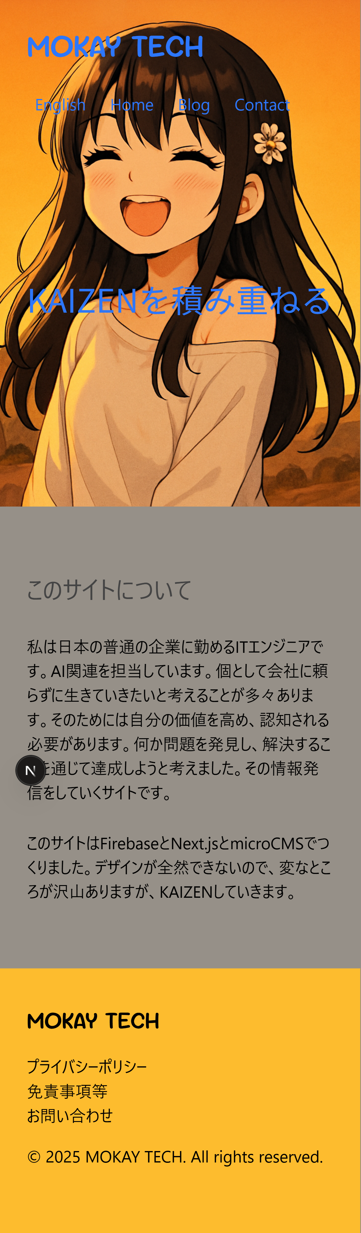
Current State
What bothers me:
- No sense of unity
- The green text over the illustration is hard to read
- Why is the footer blue?
First, Choose Your Colors
Colors carry impressions and psychological effects. For this blog I want readers to feel:
- Fun
- Relaxed
- Friendly
Orange conveys all three, so I decided to switch the main illustration to an orange-based version. (The character is my daughter, generated via AI.)
Illustration
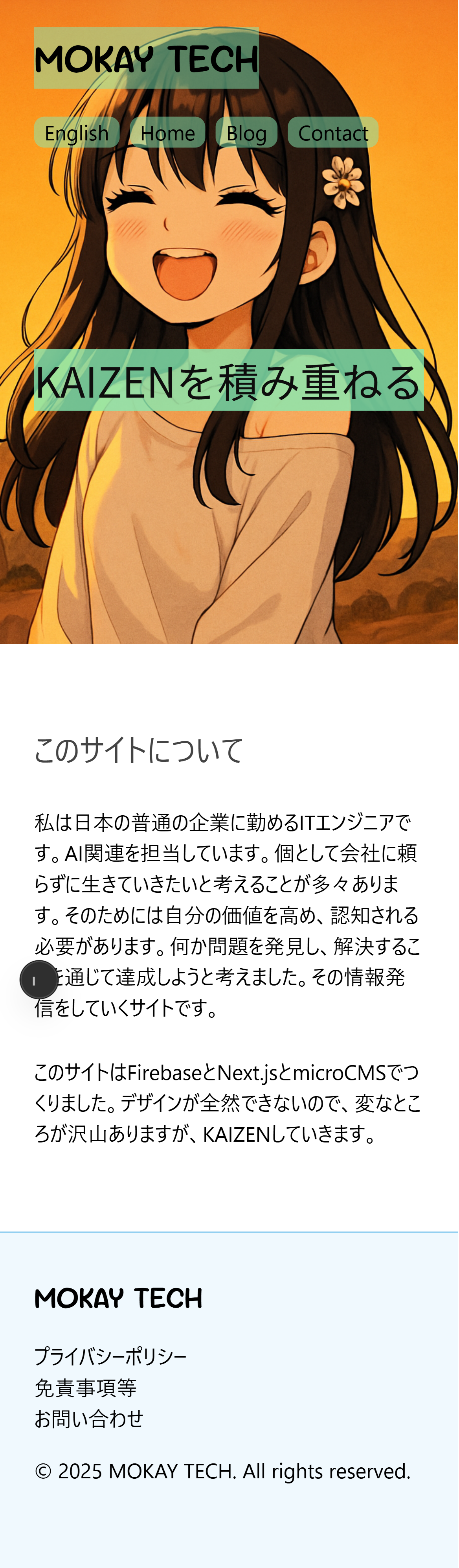
From the illustration I picked #fdbc2e as the theme color.
Thinking About Color Combinations
Which colors you use—and in what proportion—matters. A common baseline is:
| Color Type | Ratio | Purpose |
|---|---|---|
| Base Color | 70 % | Backgrounds and white space |
| Main Color | 25 % | Primary attention-getter (theme color) |
| Accent Color | 5 % | Highlights and key elements |
If you need more than three colors, split the Main Color slice. Accent colors can be analogous or complementary to the main hue.
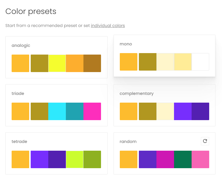
Muzli Colors
Using Muzli Colors gave me these suggestions—any one could work:
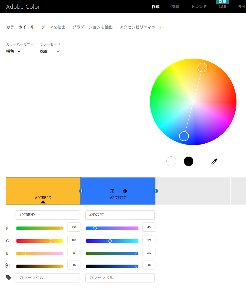
Adobe Color
Adobe Color makes complementary picks dead simple:
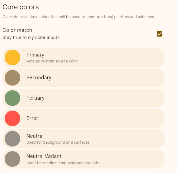
Material Theme Builder
Material Theme Builder targets UI kits, but I tried it anyway. Neutral seems to map to a base color—could be useful.
A Tentative Choice
| Color Type | Hex Code |
|---|---|
| Base Color | #969088 |
| Main Color | #fdbc2e |
| Accent Color | #2d77fc |
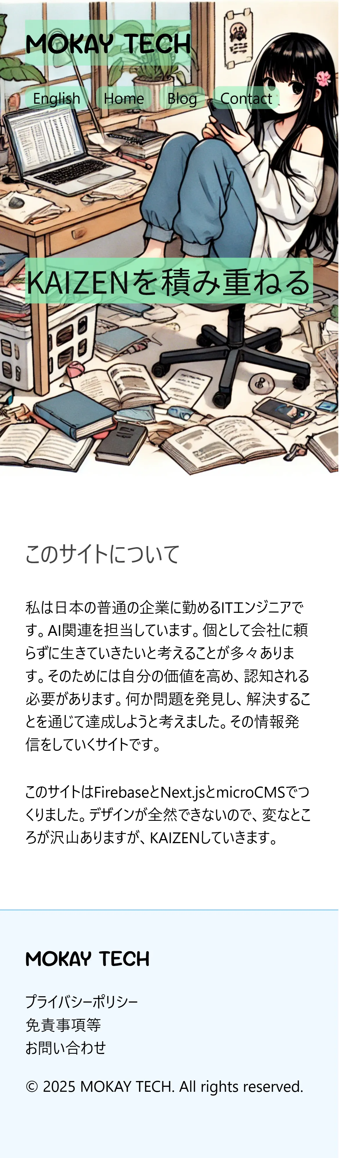
Readability Still Isn’t There
After applying these, the result still felt off—and I couldn’t pinpoint why.
Consulting ChatGPT
Prompt I used:
I changed my blog colors as follows but it still looks bad, and text on the base color is hard to read. Any advice?
| Base | #969088 | Main | #fdbc2e | Accent | #2d77fc |
Here’s a distilled version of the reply.
Identified Issues
- White or accent text on the base color lacks contrast.
- The accent hue is a bit light for body text on white.
- Using the base color across large areas dulls the page and clashes with other hues.
Contrast checks via WebAIM:
| Background | Text Color | Contrast Ratio |
|---|---|---|
#969088 (Base) |
#ffffff |
3.16 ✗ |
#969088 (Base) |
#000000 |
6.64 ✓ |
#fdbc2e (Main) |
#000000 |
12.4 ✓ |
#2d77fc (Accent) |
#ffffff |
4.07 ✓ for headlines |
(WCAG AA: 4.5+ for body, 3.0+ for 18 px bold or larger)
Improvement Directions
-
Swap the base color for a very light neutral
- Material Design Neutral 90–95 (pale gray/ivory) for the background
- Text in
#1C1B1Fstays readable - Main/Accent colors pop
-
Deepen the main and accent hues
- Main:
#fdbc2e→#F8A900 - Accent:
#2d77fc→#1A5BFA
- Main:
-
Add a dark gradient under the hero text for better white-text readability.
:root {
  --base0: #f7f5f2;   /* page background */
  --base1: #e3e1db;   /* section/card background */
  --onBase: #1c1b1f;  /* regular text */

  --main: #f8a900;    /* deeper orange */
  --onMain: #1c1b1f;

  --accent: #1a5bfa;  /* deeper blue */
  --onAccent: #ffffff;
}
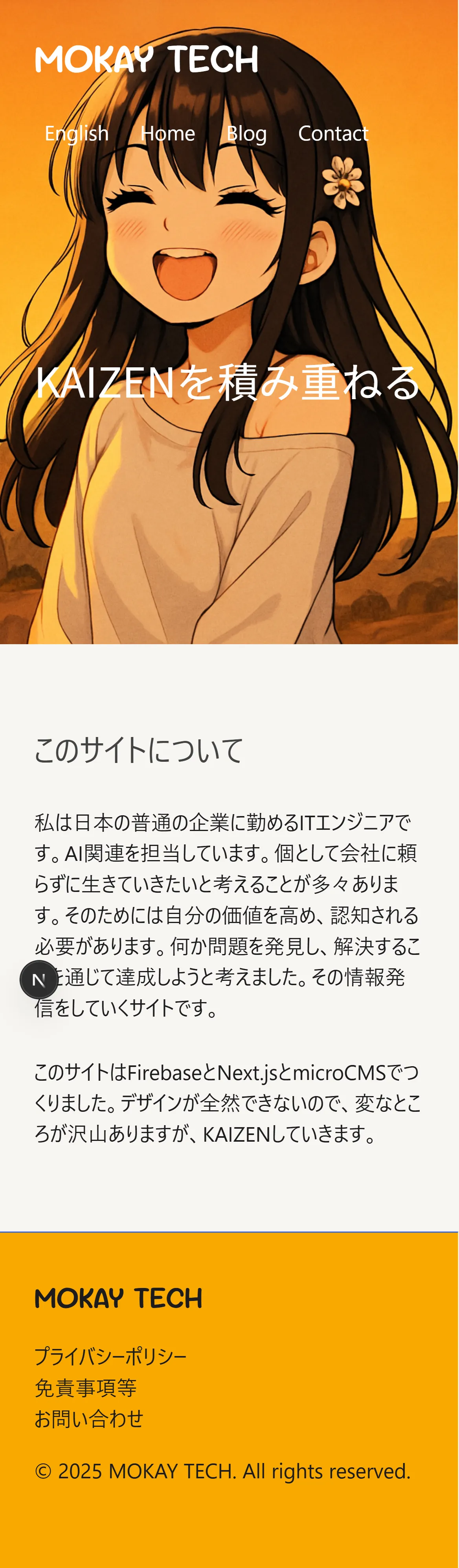
Slightly Better
The adjusted scheme definitely looks cleaner—the missing piece was contrast ratio.
Conclusion
Color work turned out tougher than typography, but at least the blog now feels unified. Next steps:
- Boost the Lighthouse performance scores
- Improve how images are displayed