
Intended Audience
- People who want to improve the overall quality of their web-page content
- People who feel their images take too long to display
- People who want to learn concrete ways to boost their Lighthouse score
Value You’ll Get from This Article
- You’ll see a real-world case where the Lighthouse score was dramatically improved.
- We show exactly how we cut LCP from 13.7 s to 1.1 s and raised the Lighthouse Performance score from 75 to 100.
Introduction
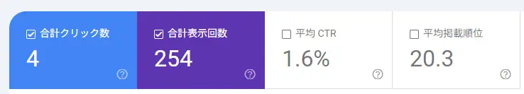
After only three months online my site has logged just 254 impressions and an average position of 20.3 in Google Search Console—almost no one is seeing it yet.
I’ve already improved typography and color in previous posts, but now I want to tackle Lighthouse performance. So I ran a Lighthouse audit in Chrome DevTools.
What Is Lighthouse?
Lighthouse is an open-source, automated tool that audits web pages and generates reports to help you improve quality.
First Audit Result
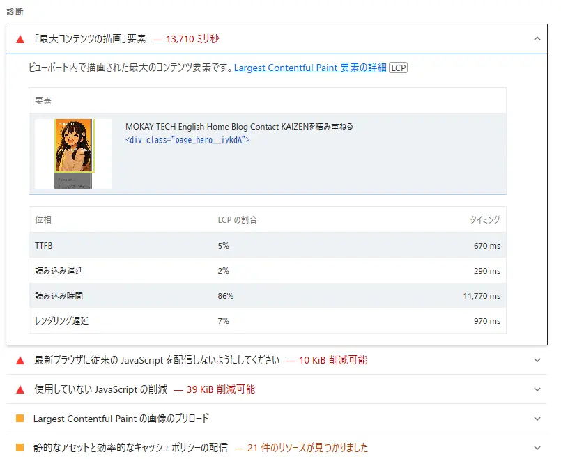
The Performance score was 75—not great.
Largest Contentful Paint (LCP) clocked in at 13.7 s. The oversized hero image is the main culprit. We’ll focus on LCP here (INP/CLS also matter, but they’re outside this article’s scope).
About the Hero Image
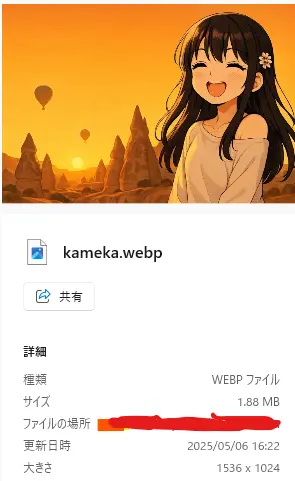
The hero weighed 1.88 MB at 1536 × 1024 px in WebP. The character is Kameka, a laid-back girl (modeled after my daughter). We’ll shrink it to speed up loading.
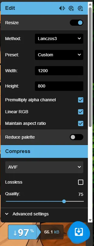
Shrinking with Squoosh
Squoosh compresses images locally (nothing is uploaded—good for security). It was created by Google.
Changes Made
- Kept aspect ratio but exported two widths: 1200 px for desktop and 767 px for mobile.
- Set Quality to 75—visually identical.
- Generated AVIF versions as well.
| File | Width | Size | Format |
|---|---|---|---|
| kameka@767.avif | 767 px | 33.1 KB | AVIF |
| kameka@767.webp | 767 px | 29.1 KB | WebP |
| kameka@1200.avif | 1200 px | 64.5 KB | AVIF |
| kameka@1200.webp | 1200 px | 54.2 KB | WebP |
About the Formats
| Format | Summary | Reference |
|---|---|---|
| AVIF | Aims to combine GIF-like animation, PNG-style transparency and better perceptual quality at smaller sizes than JPEG/WebP. Extremely small files, but Safari supports it only from 2022 onward. | https://web.dev/learn/images/avif?hl=ja |
| WebP | A lossy format meant to replace JPEG, highly versatile. | https://web.dev/learn/images/webp?hl=ja |
Updated CSS to Serve the New Images
.hero {
  background-image: url('/img/hero/kameka@767.webp');
  background-image: image-set(
    url('/img/hero/kameka@767.avif') type('image/avif') 1x,
    url('/img/hero/kameka@767.webp') type('image/webp') 1x
  );
  background-size: cover;
  background-position: right top;
}

@media (min-width: 768px) {
  .hero {
    background-image: url('/img/hero/kameka@1200.webp');
    background-image: image-set(
      url('/img/hero/kameka@1200.avif') type('image/avif') 1x,
      url('/img/hero/kameka@1200.webp') type('image/webp') 1x
    );
  }
}
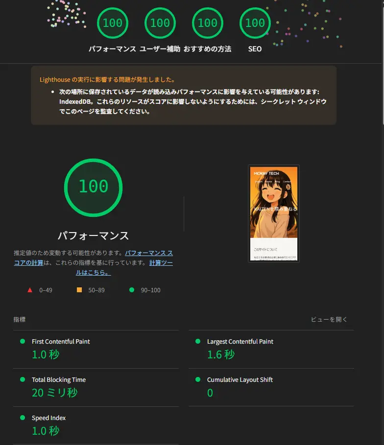
Lighthouse Now Shows a Perfect 100
All four categories hit 100.
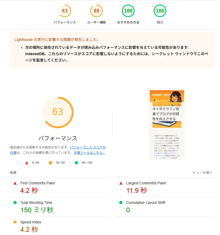
What About Dynamic background-image?
Other pages still scored 63 because their hero image is set inline via style.
Current Inline Style (microCMS)
<section
  className={`${styles.blogArticleHeader} ${appStyle.grid12}`}
  style={{
    backgroundImage: `url(${blog.eyecatch.url})`,
    backgroundSize: 'cover',
    backgroundPosition: 'center bottom',
  }}
>
  <h1>{blog.title}</h1>
  <time>{formattedDate}</time>
</section>
Switched to a <picture> Tag
<picture> lets the browser pick the best source. If it doesn’t support <picture>, the fallback <img> is used. AVIF first, then WebP.
<section className={`${styles.wrapper} ${appStyle.grid12}`}>
  <picture>
    <!-- Desktop & mobile widths via sizes/srcset -->
    <source
      type="image/avif"
      srcset={`${blog.eyecatch.url}?q=75&fit=clip&w=600&fm=avif 600w,
               ${blog.eyecatch.url}?q=75&fit=clip&w=1200&fm=avif 1200w`}
      sizes="100%"
    />
    <source
      type="image/webp"
      srcset={`${blog.eyecatch.url}?q=75&fit=clip&w=600&fm=webp 600w,
               ${blog.eyecatch.url}?q=75&fit=clip&w=1200&fm=webp 1200w`}
      sizes="100%"
    />
    <img
      className={styles.coverImg}
      src={`${blog.eyecatch.url}?q=75&fit=clip&w=800`}
      alt={blog.title}
      sizes="100%"
    />
  </picture>
  <div className={styles.info}>
    <h1>{blog.title}</h1>
    <time>{formattedDate}</time>
  </div>
</section>
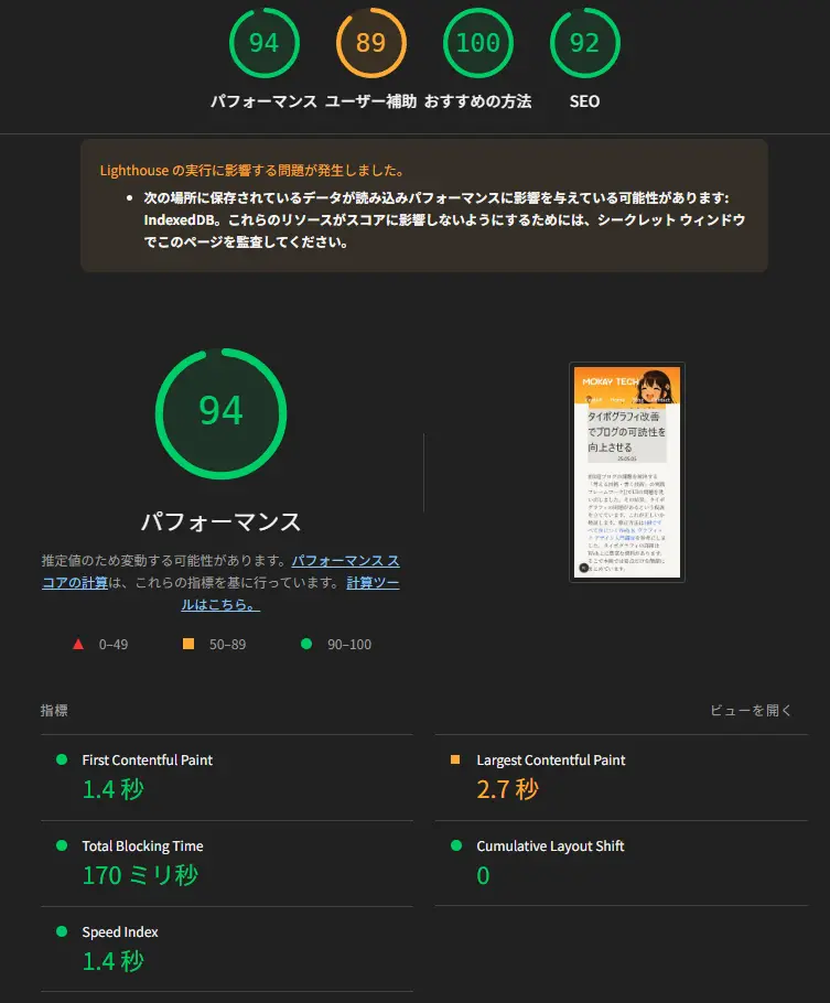
Result After the Fix
Performance jumped to 94—a huge win for a dynamic image.
Takeaway
The red Lighthouse warning boiled down to an oversized hero image. By compressing it 97 % with Squoosh and adding a responsive <picture> setup, we slashed LCP from 13.7 s to 1.1 s and boosted the mobile score from 75 to 100. The same technique lifted other pages to 94 points. All code and steps are shared here so you can replicate the results on your own site.